We understand and grasp information better when data is presented to us visually. And for management it is very important to get insights into their data quickly.
One of our On Demand Vtiger customer recently approached us to check if we can visualize their HelpDesk data. They complained that their support staff are not very much clear about the tickets assigned to them and it is hard for them to quickly get a view of critical issues. More over the supervisors complained that they are unable to get insight about how many tickets are critical and need immediate attention and whether the customer support performance is going down.
In other words they wanted to have a visual KPI. Default Vtiger Dashboard widgets are limited and to get a new widget it needs some customization. Also there are no features like auto refresh, dynamic search, inter dependency etc..
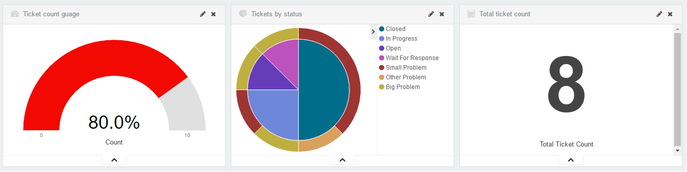
To the solution, we implemented a slick Vtiger dashboard system for them which was not just visually appealing but also very fast, capable of giving real time insights. Here is a a snap for the same:
Ok, but how do we get quick insight ?
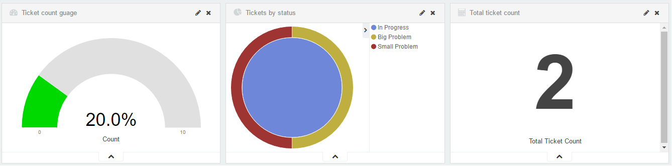
The dashboard is not a static dashboard it auto refreshes every 5 seconds and all the widgets are interdependent. As we click on a certain section in the pie chart, ticket count and the Guage Meter updates automatically.
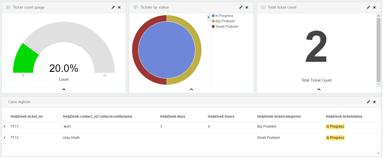
Ok, now how do I get list of tickets ?
The interface is dynamic and we can add new dashboards on the fly. This includes not just dashboard widgets but also dynamic searches (like filters in Vtiger). Below we have added a Ticket Register, which shows the list of Tickets in the selected criteria.
Want to know more about Data Visualization and Analytics possibilities ? Email us now – info@automatesmb.com